l 박스 모델
- 웹 문서에 텍스트, 이미지, 테이블 등의 요소를 배치하기 위해 사용
- 웹 문서의 전체 레이아웃을 정의
- 각종 요소들을 원하는 위치에 배치
l 박스의 속성
- content : 실제 내용이 표현되는 곳
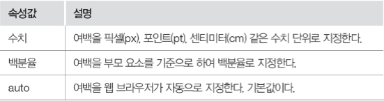
- padding : 콘텐츠와 테두리 사이의 여백
- border : 박스의 테두리 두께
- margin : 테두리와 박스의 최종 경계 사이의 여백

<!DOCTYPE html>
<html>
<head>
	<style>
		div {
			background-color: yellow;
			width: 300px;
			padding: 25px;
			border: 15px solid navy;
			margin: 25px;
		}
	</style>
<meta charset="EUC-KR">
<title>Insert title here</title>
</head>
<body>
	<p>CSS3 박스 모델은 content, padding, border, margin으로 구성되어있다.</p>
	<div>박스 모델의 padding, border, margin 속성의 기본 값은 0이며, 상하좌우 네 가지 방향을 top, bottom,
		left, right를 이용하여 지정할 수 있습니다.</div>

</body>
</html>
l Content
- 실제 내용이 표현되는 곳
- 속성: width(너비 지정), height(높이 지정)
-
<!DOCTYPE html>
<html>
<head>
<style>
p {
background-color: yellow;
color: red;
font-weight: bold;
font-size: 16pt;
}
p.c1 {
width: 700px;
height: 80px;
color: green;
}
p.c2 {
width: 50%;
height: 150%;
color: green;
}
p.c3 {
width: 10cm;
height: 3cm;
color: blue;
}
</style>
<meta charset="EUC-KR">
<title>박스의 내용 영역 크기 지정하기</title>
</head>
<body>
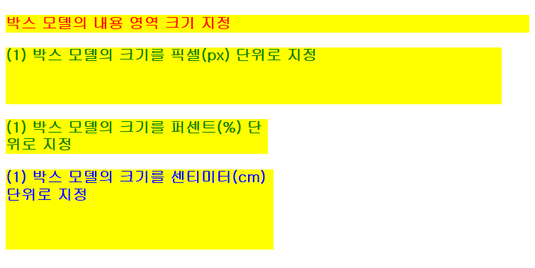
<p>박스 모델의 내용 영역 크기 지정</p>
<p class="c1">(1) 박스 모델의 크기를 픽셀(px) 단위로 지정</p>
<p class="c2">(1) 박스 모델의 크기를 퍼센트(%) 단위로 지정</p>
<p class="c3">(1) 박스 모델의 크기를 센티미터(cm) 단위로 지정</p>
</body>
</html>l padding, margin
- padding : 박스의 안쪽 여백 설정
- Margin : 박스의 바깥쪽 여백 설정

<!DOCTYPE html>
<html>
<head>
	<style>
		p {
			background-color: yellow;
			color: red;
			font-weight: bold;
			font-size: 16pt;
		}
		p.pad {
			color: purple;
			padding: 20px;
		}
		p.mar {
			color: green;
			margin: 30px;
		}
		p.mp {
			color: blue;
			padding: 5%;
			margin: 5%;
		}
	</style>
<meta charset="EUC-KR">
<title>박스의 안쪽 여백과 바깥쪽 여백 지정하기</title>
</head>
<body>
	<p>박스의 안쪽 여백과 바깥쪽 여백 지정</p>
	<p class="pad">(1) 안쪽 여백 지정 - padding 20px</p>
	<p class="mar">(2) 바깥쪽 여백 지정 - margin 30px</p>
	<p class="mp">(3) 안쪽, 바깥쪽 여백 지정 - padding 5%, margin 5%</p>

</body>
</html>
l 속성값의 개수에 따라 적용되는 위치

<!DOCTYPE html>
<html>
<head>
	<style>
		body {
			font-weight: bold;
			font-size: 16pt;
		}
		.mp1 {
			background-color: aqua;
			color: red;
			margin-bottom: 40px;
			padding-left: 50px;
		}
		.mp2 {
			background-color: silver;
			color: green;
			margin: 20px;
			padding: 10px, 20px;
		}
		.mp3 {
			background-color: gray;
			color: purple;
			margin: 50px, 15px, 20px;
			padding: 20px;
		}
	</style>
<meta charset="EUC-KR">
<title>박스의 여백을 네 방향으로 지정하기</title>
</head>
<body style="background-color: lightyellow;">
	<p>박스 모델의 네 방향 여백 지정</p>
	<p class="mp1">mp1</p>
	<p class="mp2">mp2</p>
	<p class="mp3">mp3</p>
</body>
</html>
l border-width
- 테두리 두께 설정
- Top, bottom, left, right를 이용하여 네 방향으로 설정 가능

l border-style
- 테두리 스타일 설정


<!DOCTYPE html>
<html>
<head>
	<style>
		body {
			font-family: consolas;
		}
		h3.none {
			border-style: none;
		}
		h3.hidden {
			border-style: hidden;
		}
		h3.dotted {
			border-style: dotted;
		}
		h3.dashed {
			border-style: dashed;
		}
		h3.solid {
            border-style: solid;
        }
        h3.groove {
        	border-style: groove;
        }
        h3.ridge {
        	border-style: ridge;
        }
        h3.inset {
        	border-style: inset;
        }
        h3.outset {
        	border-style: outset;
        }
        h3.mix {
        	border-style: dotted dashed solid double;
        }
	</style>
<meta charset="EUC-KR">
<title>테두리 스타일 지정하기</title>
</head>
<body>
	<h3 class="none">no none</h3>
	<h3 class="hidden">hidden border</h3>
	<h3 class="dotted">dotted border</h3>
	<h3 class="dashed">dashed border</h3>
	<h3 class="solid">solid border</h3>
	<h3 class="groove">groove border</h3>
	<h3 class="ridge">ridge border</h3>
	<h3 class="inset">inset border</h3>
	<h3 class="outset">outset border</h3>
	<h3 class="mix">mix border</h3>

</body>
</html>
ㅣ 박스 테두리 지정 (눈뽕)

<!DOCTYPE html>
<html>
<head>
	<style>
		body {
			font-weight: bold;
			font-size: 12pt;
			font-family: consolas;
		}
		.bt1 {
			background-color: aqua;
			color: red;
			margin-bottom: 15px;
			padding-left: 50px;
			border-style: dotted;
			border-width: thick;
			border-color: green;
		}
		.bt2 {
			background-color: silver;
			color: green;
			margin: 20px;
			padding: 5px 10px;
			border-style: solid;
			border-width: 1px 3px 5px 3px;
			border-color: navy red fuchsia black;
		}
        .bt3 {
            background-color: gray;
            color: purple;
            margin: 50px 15px 20px;
            padding : 20px;
            border-style: dashed double;
            border-width: 5px 0px;
            border-color: red;
        }
        .bt4 {
            border-top: 5px solid red;
            border-bottom: 5px solid red;
        }
	</style>
<meta charset="EUC-KR">
<title>테두리의 네 방향에 각각 다른 속성 지정하기</title>
</head>
<body>
    <p class="bt1">박스 테두리 지정 - 1</p>
    <p class="bt2">박스 테두리 지정 - 2</p>
    <p class="bt3">박스 테두리 지정 - 3</p>
    <p class="bt4">박스의 상하좌우 테두리는 border-top, border-right, border-bottom,
    border-left라는 속성을 이용해 지정할 수 있습니다.</p>
</body>
</html>
l border-radius
- 테두리의 모서를 둥글게 설정


<!DOCTYPE html>
<html>
<head>
	<style>
		body {
			font-weight: bold;
			font-size: 12pt;
		}
		.br1 {
			background-color: lime;
			color: red;
			border-style: solid;
			border-width: thick;
			border-color: green;
			border-radius: 30%;
		}
		.br2 {
			background-color: maroon;
			color: yellow;
			border-style: dotted;
			border-width: 2px;
			border-color: white;
			border-radius: 15px 35px;
		}
		.br3 {
			background-color: teal;
			color: aqua;
			border-style: dashed;
			border-width: 5px;
			border-color: red;
			border-radius: 5px 15px 25px 35px;
		}
		.br4 {
			border: 3px solid red;
			border-top-left-radius: 30px;
		}
	</style>
<meta charset="EUC-KR">
<title>박스에 둥근 모서리 적용하기</title>
</head>
<body>
	<h1 class="br1">둥근 모서리 스타일링 예제 1</h1>
	<h1 class="br2">둥근 모서리 스타일링 예제 2</h1>
	<h1 class="br3">둥근 모서리 스타일링 예제 3</h1>
	<h1 class="br4">둥근 모서리 스타일링 예제 4</h1>
</body>
</html>
l box-shadow
- 박스에 그림자 효과 적용
l
box-shadow : 수평 그림자(필수) | 수직 그림자(필수) | 그림자 흐림 | 그림자 변경 | 그림자 색상 | 삽입 효과;
- 수평 그림자(h-shadow): 그림자의 수평 거리 지정
- 수직 그림자(v-shadow): 그림자의 수직 거리 지정
- 그림자 흐림(blur): 그림자의 흐림 정도 지정
- 그림자 번짐(spread): 그림자의 번짐 정도 지정
- 그림자 색상(color): 그림자의 색상 지정
- 삽입 효과(inset): 박스 외부로 표현되는 그림자를 박스 안쪽으로 표현하는 효과

<!DOCTYPE html>
<html>
<head>
	<style>
		body {
			font-weight: bold;
			font-size: 12pt;
		}
		.boxshadow1 {
			background-color: yellow;
			border: 5px solid blue;
			box-shadow: 10px 10px 0px teal;
		}
		.boxshadow2 {
		 	background-color: orange;
		 	border: 5px solid red;
		 	box-shadow: 20px 20px 50px red;
		}
		.boxshadow3 {
			background-color: silver;
			border: 5px solid black;
			box-shadow: 20px 20px 30px -20px maroon;
		}
		.boxshadow4 {
			background-color: lime;
			border: 5px solid olive;
			box-shadow: 10px 10px 0px 10px fuchsia inset;
		}
	</style>
<meta charset="EUC-KR">
<title>박스에 그림자 효과 주기</title>
</head>
<body>
	<h1 class="boxshadow1">박스 그림자 스타일링 예제 1</h1>
	<h1 class="boxshadow2">박스 그림자 스타일링 예제 2</h1>
	<h1 class="boxshadow3">박스 그림자 스타일링 예제 3</h1>
	<h1 class="boxshadow4">박스 그림자 스타일링 예제 4</h1>
</body>
</html>
그림자 효과 2
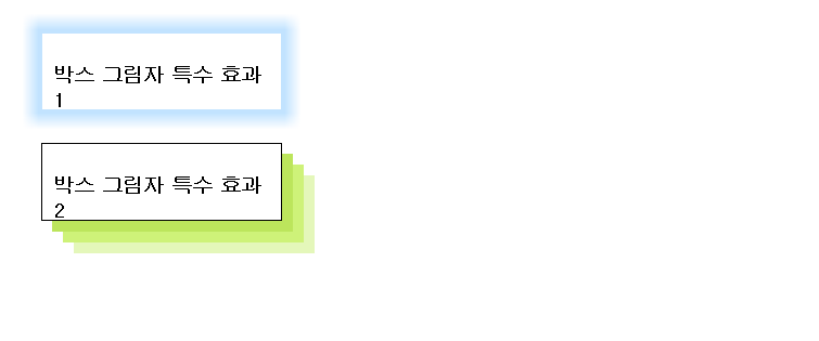
<!DOCTYPE html>
<html>
<head>
	<style>
		div {
			width: 200px;
			height: 50px;
			padding: 10px;
			margin: 30px;
		}
		#bs1 {
			border: 1px solid rgba(102, 186, 255, 0.4);
			box-shadow: 0px 0px 20px 10px rgba(102, 186, 255, 0.4);
		}
		#bs2 {
			border: 1px solid black;
			box-shadow: 10px 10px #BCE55C, 20px 20px #CEF279, 30px 30px #E4F7BA;
		}
	</style>
<meta charset="EUC-KR">
<title>Insert title here</title>
</head>
<body>
	<div id="bs1">
		<h3>박스 그림자 특수 효과1</h3>
	</div>
	<div id="bs2">
		<h3>박스 그림자 특수 효과2</h3>
	</div>
</body>
</html>
그림자 효과 2_1

<!DOCTYPE>
<head>
    <style>
        img {
            padding: 20px;
            margin: 20px;
        }
        .shadow1 {    /* Bottom right coner */
            box-shadow: 5px 5px 10px #000;
        }
        .shadow2 {    /* Up right coner */
            box-shadow: 5px -5px 10px #000;
        }
    </style>
</head>
<body>
    <img src="pic1.jpg" class="shadow1">
    <img src="pic2.jpg" class="shadow2">
</body>
l position
- 텍스트, 이미지, 표 등의 요소를 웹 문서에 배치할 때 사용하는 속성

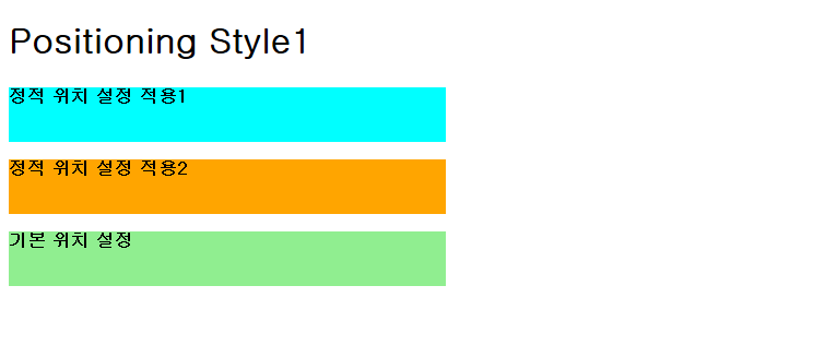
l 정적 위치 설정
- 텍스트, 이미지, 표 등을 웹 문서의 흐름에 따라 배치하는 방법
- 블록 요소는 위에서 아래로 쌓이고, 인라인 요소는 같은 줄에 순서대로 배치
<!DOCTYPE html>
<html>
<head>
	<style>
		body {
			font-weight: bold;
			font-size: 12pt;
		}
		.sp1 {
			position: static;
			top: 100px;	/* 적용되지 않음*/
			background-color: cyan;
			width: 400px;
			height: 50px;
		}
		.sp2 {
			position: static;
			left: 30px;	/* 적용되지 않음*/
			background-color: orange;
			width: 400px;
			height: 50px;
		}
		.sp3 {
			background-color: lightgreen;
			width: 400px;
			height: 50px;
		}
	</style>
<meta charset="EUC-KR">
<title>정적 위치 설정</title>
</head>
<body>
	<h1>Positioning Style1</h1>
	<p class="sp1">정적 위치 설정 적용1</p>
	<div class="sp2">정적 위치 설정 적용2</div>
	<p class="sp3">기본 위치 설정</p>
</body>
</html>
l 상대 위치 설정
- 각종 요소가 웹 문서의 정적 위칫값에서 상대적으로 얼마나 떨어져 있는지 표시하여 배치하는 방법

<!DOCTYPE html>
<html>
<head>
	<style>
		body {
			font-weight: bold;
			font-size: 12pt;
		}
		.sp {
			position: static;
			left: 30px;
			background-color: cyan;
			width: 400px;
			height: 50px;
		}
		.rp1 {
			position: relative;
			left: 30px;
			top: -10px;
			background-color: orange;
			width: 400px;
			height: 50px;
		}
		.rp2 {
			position: relative;
			left: 60px;
			top: 20px;
			background-color: lightgreen;
			width: 400px;
			height: 50px;
		}
	</style>
<meta charset="EUC-KR">
<title>상대 위치 설정으로 요소 배치하기</title>
</head>
<body>
	<h1>Position Style2</h1>
	<p class="sp">정적 위치 설정 적용</p>
	<div class="rp1">상대 위치 설적 적용 - left 30px, top -10px</div>
	<p class="rp2">상대 위치 설정 적용 - left 60px, top 20px</p>
</body>
</html>
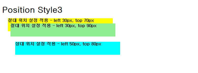
l 절대 위치 설정
- 웹 문서의 흐름과는 상관없이 전체 페이지를 기준으로 top, right, bottom, left의 속성을 이용하여 원하는 위치에 배치시키는 방법
<!DOCTYPE html>
<html>
<head>
	<style>
		body {
			font-weight: bold;
			font-size: 12pt;
		}
		.ap1 {
			position: absolute;
			left: 30px;
			top: 70px;
			background-color: yellow;
			width: 400px;
			height: 50px;
		}
		.ap2 {
			position: absolute;
			left: 40px;
			top: 90px;
			background-color: lightgreen;
			width: 400px;
			height: 50px;
		}
		.rp {
			position: relative;
			left: 50px;
			top: 80px;
			background-color: cyan;
			width: 400px;
			height: 50px;
		}
	</style>
<meta charset="EUC-KR">
<title>절대 위치 설정으로 요소 배치하기</title>
</head>
<body>
	<h1>Position Style3</h1>
	<div class="ap1">절대 위치 설정 적용 - left 30px, top 70px</div>
	<div class="ap2">절대 위치 설정 적용 - left 30px, top 90px</div>
	<div class="rp">상대 위치 설정 적용 - left 50px, top 80px</div>
</body>
</html>
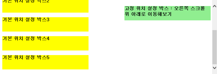
l 고정 위치 설정
- 창의 스크롤을 움직여도 사라지지 않고 고정된 위치에 그대로 있음

<!DOCTYPE html>
<html>
<head>
	<style>
		body {
			font-weight: bold;
			font-size: 12pt;
		}
		.p {
			background-color: yellow;
			width: 300px;
			height: 50px;
		}
		.fp {
			position: fixed;
			right: 5px;
			top: 5px;
			background-color: lightgreen;
			width: 300px;
			height: 50px;
		}
	</style>
<meta charset="EUC-KR">
<title>고정 위치 설정으로 요소 배치하기</title>
</head>
<body>
	<h1>Position Style4</h1>
	<p class="p">기본 위치 설정 박스1</p>
	<p class="p">기본 위치 설정 박스2</p>
	<p class="p">기본 위치 설정 박스3</p>
	<p class="p">기본 위치 설정 박스4</p>
	<p class="p">기본 위치 설정 박스5</p>
	<p class="fp">고정 위치 설정 박스 : 오른쪽 스크롤 위 아래로 이동해보기</p>
</body>
</html>
l float
- 화면을 구성하는 요소 간의 관계를 고려하여 각 요소를 배치하는 방법


<!DOCTYPE html>
<html>
<head>
	<style>
        img {
            float: right;
            margin: 0 0 10px 10px;
        }
	</style>
<meta charset="EUC-KR">
<title>float 속성 사용하기 </title>
</head>
<body>
    <p>float 속성은 웹 문서의 레이아웃을 설계하는 과정에서 많이 사용하는 속성입니다.</p>
    <p><img src="pic1.jpg" alt="image" width="140" height="140"></p>
    float 속성은 특정 요소를 떠 있게 해줍니다. 여기서 '떠 있다'라는 말의 의미는 특정 요소가 기본 레이아웃에서 벗어나 웹 문서의 왼쪽이나 오른쪽에 이동하는 것을 말합니다. float 속성은 복잡한 형태의 레이아웃을 구성하는 데 필요한 핵심 속성으로 특정 요사가 주변 요소와 자연스럽게 어울리도록 해줍니다. 주의할 점은 float 속성을 사용할 때 요소의 위치가 고정되면 안 되기 때문에 position 속성의 absolute를 사용하면 안됩니다.
</body>
</html>
l clear
- float 속성이 적용되지 않도록 할 때 사용

<!DOCTYPE html>
<html>
<head>
	<style>
        .div1 {
            float: left;
            width: 100px;
            height: 50px;
            margin: 10px;
            border: 3px solid #73AD21;
        }
        .div2 {
            border: 1px solid red;
        }
        .div3 {
            float: left;
            width: 100px;
            height: 50px;
            margin: 10px;
            border: 3px solid #73AD21;
        }
        .div4 {
            border: 1px solid red;
            clear: left;
        }
	</style>

<meta charset="EUC-KR">
<title> </title>
</head>
<body>
    <h2>float 속성 사용</h2>
    <div class="div1">div1</div>
    <div class="div2">div2 - float 속성을 사용하여 대상 요소를 웹 문에서 배치하면 그 다음 요소에도 똑같은 속성이 적용됩니다. 하지만 float 속성이 사용되는 것을 원하지 않을 때도 있습니다. 이때 clear 속성을 적절히 잘 사용해야 합니다.</div>
    <h2>clear 속성 사용</h2>
    <div class="div3">div3</div>
    <div class="div4">div4 - clear 속성은 float 속성이 적용되는 것을 원하지 않는 요소에 사용하여 float 속성을 초기화 시킵니다. float: left;를 사용했다면 clear: left; 로, right;를 사용했다면 clear: right;로 초기화 합니다. float 속성 값이 left 인지 right 인지 상관없이 무조건 초기화하고 싶다면 clear: both;를 사용합니다. 보통 clear: both;를 많이 사용합니다.</div>
</body>
</html>
l overflow
- auto로 설정하면 이미지가 박스 영역을 벗어나는 현상을 해결할 수 있음

<!DOCTYPE>
<head>
    <style>
        div {
            border: 3px solid #73AD21;
        }
        .img1 {
            float: right;
        }
        .fix {
            overflow: auto;
        }
        .img2 {
            float: right;
        }
    </style>
</head>
<body>
    <p>이미지가 박스 영역을 벗어남</p>
    <div> <img class="img1" src="pic2.jpg" alt="image" width="140" height="140">
    이미지가 오른쪽 정렬로 되어 있는데, 박스 영역을 벗어났습니다.</div>
    <p style="clear: right">overflow: auto; 속성을 사용하여 해결</p>
    <div class="fix"><img class="img2" src="pic2.jpg" alt="img" width="140" height="140">이미지가 박스 영역을 벗어날 경우에는 overflow auto로 설정하여 해결합니다.</div>
</body>
ㅣ 시맨틱 문서 구조에 float 속성 사용하기
<!DOCTYPE>
<head>
<style>
div {
border: 3px solid blue;
}
.fix {
overflow: auto;
}
nav {
float: left; width: 200px; border: 3px solid #73AD21;
}
section {
margin-left: 206px; border: 3px solid red;
}
</style>
</head>
<body>
<div class="fix">
<nav>
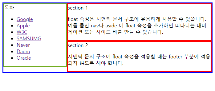
<span>목차</span>
<ul>
<li><a target="_blank" href="http://www.google.com">Google</a> </li>
<li><a target="_blank" href="http://www.apple.com">Apple</a></li>
<li><a target="_blank" href="http://www.w3.org">W3C</a></li>
<li><a target="_blank" href="http://www.samsung.com">SAMSUMG</a></li>
<li><a target="_blank" href="http://www.naver.com">Naver</a></li>
<li><a target="_blank" href="http://www.daum.net">Daum</a></li>
<li><a target="_blank" href="http://www.oracle.com">Oracle</a></li>
</ul>
</nav>
<section>
<span>section 1</span>
<p>float 속성은 시맨틱 문서 구조에 유용하게 사용할 수 있씁니다. 예를 들만 nav나 aside 에 float 속성을 초가하면 떠다니는 내비게이션 또는 사이드 바를 만들 수 있습니다.</p>
</section>
<section>
<span>section 2</span>
<p>시맨틱 문서 구조에 float 속성을 적용할 때는 footer 부분에 적용되지 않도록 해야 합니다.</p>
</section>
</div>
</body>l z-index
- 한 요소 위에 다른 요소를 쌓을 때 사용
- z-index 속성값이 작을수록 아래에 쌓임

<!DOCTYPE>
<head>
<style>
#box1 {
position: absolute;
top: 0px;
left: 0px;
width: 100px;
height: 100px;
background: blue;
z-index: 3;
}
#box2 {
position: absolute;
top: 30px;
left: 30px;
width: 100px;
height: 100px;
background: yellow;
z-index: 2;
}
#box3 {
position: absolute;
top: 60px;
left: 60px;
width: 100px;
height: 100px;
background: green;
z-index: 1;
}
</style>
</head>
<body>
<div id="box1">box #1</div>
<div id="box2">box #2</div>
<div id="box3">box #3</div>
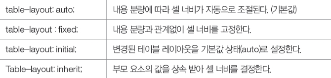
</body>l table-layout
- 셀 안 내용의 양에 따라 셀 너비를 조절

<!DOCTYPE>
<head>
    <style>
        td, th {
            border: 1px solid black;
        }
        #tb1 {
            border: 2px solid red;
            table-layout: auto;
        }
        #tb2 {
            border: 3px dotted teal;
            background-color: bisque;
            table-layout: fixed;
        }
    </style>
</head>
<body>
    <h2>table layout auto 예제</h2>
    <table id="tb1">
        <tr>
            <th>table layout auto</th>
            <td>내용 분량에 따라서 자동으로 조절</td>
        </tr>
    </table>
    <h2>table layout fixex 예제</h2>
        <table id="tb2" width="250px">
            <tr>
                <th>table layout fixed</th>
                <td>내용 분량과 상관없이 고정</td>
            </tr>
        </table>
</body>
ㅣ 셀 테두리 출력하기

<head>
<style>
td, th {
border: 2px solid black;
}
#tb1 {
border: 3px solid green;
background-color: blanchedalmond;
border-collapse: separate;
table-layout: auto;
}
#tb2 {
border: 3px solid green;
background-color: blanchedalmond;
border-collapse: collapse;
table-layout: auto;
}
</style>
</head>
<body>
<table style id="tb1" width="350px">
<tr>
<th>table border-collapse</th>
<td>separate 적용</td>
</tr>
</table>
<p></p>
<table style id="tb2" width="350px">
<tr>
<th>table border-collapse</th>
<td>collapse 적용</td>
</tr>
</table>
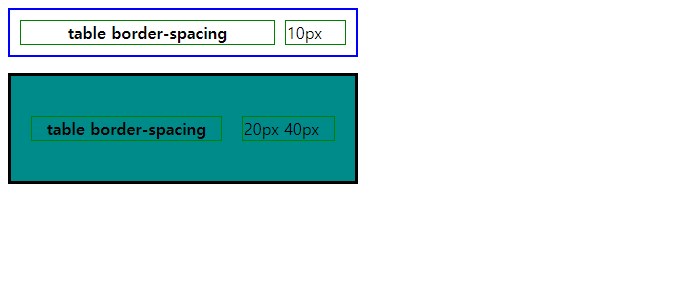
</body>ㅣ 바깥 테두리와 셀 테두리 사이 간격 조정하기
<!DOCTYPE>
<head>
<style>
td, th {
border: 1px solid green;
}
#tb1 {
border: 2px solid blue;
border-spacing: 10px; /* 상하좌우 */
}
#tb2 {
border: 3px solid black;
background-color: darkcyan;
border-spacing: 20px 40px; /* 첫번째 값 : 좌우, 두번째 값 : 상하*/
}
</style>
</head>
<body>
<table style id="tb1" width="350px">
<tr>
<th>table border-spacing</th>
<td>10px</td>
</tr>
</table>
<p></p>
<table style id="tb2" width="350px">
<tr>
<th>table border-spacing</th>
<td>20px 40px</td>
</tr>
</table>
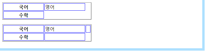
</body>ㅣ빈 셀을 보이게 하거나 숨기기
<!DOCTYPE>
<head>
<style>
td, th {
border: 1px solid blue;
}
#tb1 {
border-collapse: separate;
empty-cells: hide;
}
#tb2 {
border-collapse: separate;
empty-cells: show;
}
</style>
</head>
<body>
<table id="tb1" border="1" width="300px">
<tr>
<th>국어</th>
<td>영어</td>
<td></td>
</tr>
<tr>
<th>수학</th>
<td></td>
</tr>
</table>
<p></p>
<table id="tb2" border="1" width="300px">
<tr>
<th>국어</th>
<td>영어</td>
<td></td>
</tr>
<tr>
<th>수학</th>
<td></td>
</tr>
</table>
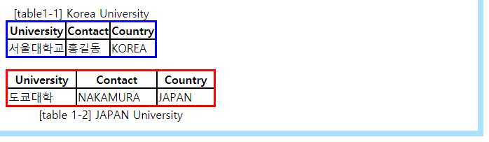
</body>ㅣ 캡션 삽입하기
<!DOCTYPE>
<head>
    <style>
        td, th {
            border: 2px solid black;
        }
        #c1 {
            border: 3px solid blue;
            caption-side: top;
            border-collapse: collapse;
        }
        #c2 {
            border: 3px solid red;
            caption-side: bottom;
            border-collapse: collapse;
        }
    </style>
</head>
<body>
    <table id="c1" border="1" widht="300px">
        <caption>[table1-1] Korea University</caption>
        <tr>
            <th>University</th>
            <th>Contact</th>
            <th>Country</th>
        </tr>
        <tr>
            <td>서울대학교</td>
            <td>홍길동</td>
            <td>KOREA</td>
        </tr>
    </table>
    <p></p>
    <table id="c2" border="1" width="300px">
        <caption>[table 1-2] JAPAN University</caption>
        <tr>
            <th>University</th>
            <th>Contact</th>
            <th>Country</th>
        </tr>
        <tr>
            <td>도쿄대학</td>
            <td>NAKAMURA</td>
            <td>JAPAN</td>
        </tr>
    </table>
</body>'CSS3' 카테고리의 다른 글
| flex 모음 (0) | 2024.09.09 |
|---|---|
| 컬러 고민이라면? 링크 (0) | 2022.08.01 |
| css 참고 페이지 (0) | 2021.08.19 |
| CSS3 (Cascading Style Sheets) (0) | 2021.05.04 |