리액트 컴포넌트 스타일링
Sass 는 CSS pre-processer
두가지의 확장자가 있음
.sass / .scss
보통 .scss 문법이 더 많이 사용된다.
솔직히 걍 JSP에 사용하는 부트스트랩처럼
antd 나 머터리얼 mui 같은 프론드엔드 프레임워크를 쓰는게 정신건강에 좋긴한데
기본적은것은 알고 가야할거 같아서 배워본다.
.sass
$font-stack:    Helvetica, sans-serif
$primary-color: #333

body
  font: 100% $font-stack
  color: $primary-color
.scss
$font-stack:    Helvetica, sans-serif;
$primary-color: #333;

body {
  font: 100% $font-stack;
  color: $primary-color;
}
새 프로젝트를 만들고 node-sass 라이브러리를 설치하자
node-sass 는 sass를 CSS 로 변환해주는 역할을 함
$ npx create-react-app 프로젝트명

$ yarn add node-sass
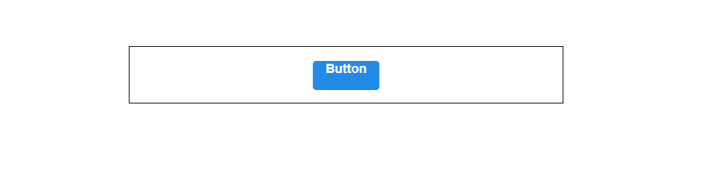
Button 컴포넌트 만들기
src 디렉토리에 components 디렉토리를 생성하고 Button 컴포넌ㅌ를 만들자
import React from 'react';
import './Button.scss';

function Button({ children }) {
  return <button className="Button">{children}</button>;
}

export default Button;
같은 componets 에 Button.scss 파일도 생성
// 선언
$blue: #228be6;

.Button {
  display: inline-flex;
  color: white;
  font-weight: bold;
  outline: none;
  border-radius: 4px;
  border: none;
  cursor: pointer;

  height: 2.25rem;
  padding-left: 1rem;
  padding-right: 1rem;
  font-size: 1rem;

  // 사용
  background: $blue;
  &:hover {
    // 색상, 10% 밝게
    background: lighten($blue, 10%);
  }

  &:active {
    // 색상, 10% 어둡게
    background: darken($blue, 10%);
  }
}
$blue 처럼 변수를 선언 할 수도 있고
ligthen(), darken() 처럼 함수를 사용 할 수도 있음
App components 에서 사용해보자
import React from 'react';
import './App.scss';
import Button from './components/Button';

function App() {
  return (
    <div className="App">
      <div className="buttons">
        <Button>BUTTON</Button>
      </div>
    </div>
  );
}

export default App;
App.css >>> App.scss 변경
.App {
  text-align: center;
  width: 512px;
  margin: 0 auto;
  margin-top: 4rem;
  border: 1px solid black;
  padding: 1rem;
}
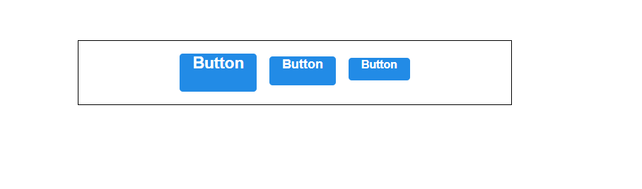
버튼 사이즈 조정하기
버튼 크기에 large, medium, small 를 설정해보자
Button.js 에서 defalutProps 를 사용해서 size 의 기본값을 medium 으로 설정, 이 값을 button의 className에 넣자
import React from "react";
import './Button.scss';

function Button({children, size}) {
    // 1번 방법
    return <button className={['Button', size].join(' ')}>{children}</button>
    // 2번 방법
    return <button className={`Button${size}`}>{children}</button>
}

Button.defaultProps = {
    size: 'medium'
};

export default Button;
className 에 CSS 클래스 이름을 동적으로 넣으려면 1번과 2번방법이 있다.
개인적으론 2번이 좋은듯
그치만 조건부로 CSS 클래스를 넣어주고 싶을때 문자열을 직접 조합하는것 보단
classnames 라이브러리를 사용하는것이 좋다
classNames 를 사용하면 조건부 스타일링을 할 때 함수의 인자에 문자열, 배열, 객체 등을 전달해서 쉽게 문자열 조합가능
classNames('foo', 'bar'); // => 'foo bar'
classNames('foo', { bar: true }); // => 'foo bar'
classNames({ 'foo-bar': true }); // => 'foo-bar'
classNames({ 'foo-bar': false }); // => ''
classNames({ foo: true }, { bar: true }); // => 'foo bar'
classNames({ foo: true, bar: true }); // => 'foo bar'
classNames(['foo', 'bar']); // => 'foo bar'

// 동시에 여러개의 타입으로 받아올 수 도 있습니다.
classNames('foo', { bar: true, duck: false }, 'baz', { quux: true }); // => 'foo bar baz quux'

// false, null, 0, undefined 는 무시됩니다.
classNames(null, false, 'bar', undefined, 0, 1, { baz: null }, ''); // => 'bar 1'
프로젝트에 설치
$ yarn add classnames안된다면 아래걸로(난 이걸로함)
$ npm install classnames아니면
yarn remove node-sass
yarn add sass
Button.js 에 적용
import React from "react";
import './Button.scss';
import classNames from 'classnames';

function Button({children, size}) {
    // 1번 방법
    return <button className={['Button', size].join(' ')}>{children}</button>;
    // 2번 방법
    return <button className={`Button${size}`}>{children}</button>;
    // classnames
    return <button className={classNames('Button', size)}>{children}</button>;

}

Button.defaultProps = {
    size: 'medium'
};

export default Button;
props 로 받은 값이 button 태그의 className 로 전달이 될 것임
Button.scss 에서 크기를 지정해보자
// 주석 선언
$blue: #228be6;

.Button {
  display: inline-flex;
  color: white;
  font-weight: bold;
  outline: none;
  border-radius: 4px;
  border: none;
  cursor: pointer;

  height: 2.25rem;
  padding-left: 1rem;
  padding-right: 1rem;
  font-size: 1rem;

  // 주석 사용
  background: $blue;
  &:hover {
    // 색상, 10% 밝게
    background: lighten($blue, 10%);
  }

  &:active {
    // 색상, 10% 어둡게
    background: darken($blue, 10%);
  }

  // 사이즈 관리
  &.large {
    height: 3rem;
    padding-left: 1rem;
    padding-right: 1rem;
    font-size: 1.25rem;
  }

  &.medium {
    height: 2.25rem;
    padding-left: 1rem;
    padding-right: 1rem;
    font-size: 1rem;
  }

  &.small {
    height: 1.75rem;
    font-size: 0.875rem;
    padding-left: 1rem;
    padding-right: 1rem;
  }
}
추가설명 ::
.Button {
  &.large {

  }
}
// 위의코드가 의미하는 것
.Button.large {

}
Aps.js 에서 버튼 2개를 추가로 렌더링하고 size 값을 설정해보자
import logo from './logo.svg';
import './App.scss';
import Button from "./components/Button";

function App() {
  return (
      <div className="App">
        <div className="buttons">
          <Button size="large">Button</Button>
          <Button>Button</Button>
          <Button size="small">Button</Button>
        </div>
      </div>
  );
}

export default App;
요즘같은 더운날에 붙어있으면 어지러우니까 떨어지게 해주자
Button.scss > .Button {} 에 아래코드를 추가
  // & + & 가 의미 하는것 => .Button + .Button / 같이 있다면? 여백설정
  & + & {
    margin-left: 1rem;
  }
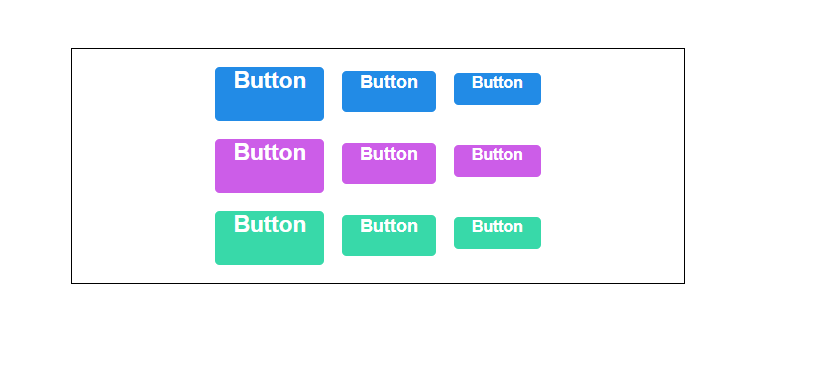
이제 버튼의 색상을 설정해보자
Button.scss
// 선언
$blue: #228be6;
$grape: #cc5de8;
$teal:#38d9a9;

.Button {
  display: inline-flex;
  color: white;
  font-weight: bold;
  outline: none;
  border-radius: 4px;
  border: none;
  cursor: pointer;

  height: 2.25rem;
  padding-left: 1rem;
  padding-right: 1rem;
  font-size: 1rem;

  // 주석 사용
  background: $blue;
  &:hover {
    // 색상, 10% 밝게
    background: lighten($blue, 10%);
  }

  &:active {
    // 색상, 10% 어둡게
    background: darken($blue, 10%);
  }

  // 사이즈 관리
  &.large {
    height: 3rem;
    padding-left: 1rem;
    padding-right: 1rem;
    font-size: 1.25rem;
  }

  &.medium {
    height: 2.25rem;
    padding-left: 1rem;
    padding-right: 1rem;
    font-size: 1rem;
  }

  &.small {
    height: 1.75rem;
    font-size: 0.875rem;
    padding-left: 1rem;
    padding-right: 1rem;
  }

  // & + & 가 의미 하는것 => .Button + .Button / 같이 있다면? 여백설정
  & + & {
    margin-left: 1rem;
  }

  // 색상 관리
  &.grape {
    background: $grape;

    &:hover {
      background: lighten($grape, 10%);
    }

    &:active {
      background: darken($grape, 10%);
    }
  }

  &.teal {
    background: $teal;

    &:hover {
      background: lighten($teal, 10%);
    }

    &:active {
      background: darken($teal, 10%);
    }
  }
}
이렇게 해줬는데 반복되는 코드는 정리해주고 싶은 기분이 든다
  // 반복되는 코드들
  background: $blue;
  &:hover {
    // 색상, 10% 밝게
    background: lighten($blue, 10%);
  }

  &:active {
    // 색상, 10% 어둡게
    background: darken($blue, 10%);
  }


  &.grape {
    background: $grape;

    &:hover {
      background: lighten($grape, 10%);
    }

    &:active {
      background: darken($grape, 10%);
    }
  }

  &.teal {
    background: $teal;

    &:hover {
      background: lighten($teal, 10%);
    }

    &:active {
      background: darken($teal, 10%);
    }
  }
그럼 mixin 라는 기능을 사용해서 재사용 해주자
주의 :::: mixin 에 문제가 많다고 판단된다는 react 공식 문서에 글이 있는것을 확인.
https://ko.reactjs.org/blog/2016/07/13/mixins-considered-harmful.html
Mixins Considered Harmful – React Blog
“How do I share the code between several components?” is one of the first questions that people ask when they learn React. Our answer has always been to use component composition for code reuse. You can define a component and use it in several other co
ko.reactjs.org
재사용한 Button.scss
// 선언
$blue: #228be6;
$grape: #cc5de8;
$teal: #38d9a9;

@mixin button-color($color) {
  background: $color;
  &:hover {
    background: lighten($color, 10%);
  }
  &:active {
    background: darken($color, 10%);
  }
}

.Button {
  display: inline-flex;
  color: white;
  font-weight: bold;
  outline: none;
  border-radius: 4px;
  border: none;
  cursor: pointer;

  height: 2.25rem;
  padding-left: 1rem;
  padding-right: 1rem;
  font-size: 1rem;

  // 사이즈 관리
  &.large {
    height: 3rem;
    padding-left: 1rem;
    padding-right: 1rem;
    font-size: 1.25rem;
  }

  &.medium {
    height: 2.25rem;
    padding-left: 1rem;
    padding-right: 1rem;
    font-size: 1rem;
  }

  &.small {
    height: 1.75rem;
    font-size: 0.875rem;
    padding-left: 1rem;
    padding-right: 1rem;
  }

  // & + & 가 의미 하는것 => .Button + .Button / 같이 있다면? 여백설정
  & + & {
    margin-left: 1rem;
  }

  &.blue {
    @include button-color($blue);
  }

  &.grape {
    @include button-color($grape);
  }

  &.teal {
    @include button-color($teal);
  }
}
App.js 에서 코드가 잘 되었는지 확인해보자
import './App.scss';
import Button from "./components/Button";

function App() {
  return (
      <div className="App">
        <div className="buttons">
          <Button size="large">Button</Button>
          <Button>Button</Button>
          <Button size="small">Button</Button>
        </div>
        <div className="buttons">
          <Button size="large" color="grape">Button</Button>
          <Button color="grape">Button</Button>
          <Button size="small" color="grape">Button</Button>
        </div>
        <div className="buttons">
          <Button size="large" color="teal">Button</Button>
          <Button color="teal">Button</Button>
          <Button size="small" color="teal">Button</Button>
        </div>
      </div>
  );
}

export default App;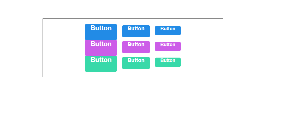
또 붙어있으니까 떼어주도록 하자
App.scss
.App {
  text-align: center;
  width: 512px;
  margin: 0 auto;
  margin-top: 4rem;
  border: 1px solid black;
  padding: 1rem;
  .buttons + .buttons {
    margin-top: 1rem;
  }

}
outline 옵션 설정
이번에는 색상을 테두리에만 줘보자
import React from "react";
import './Button.scss';
import classNames from 'classnames';

function Button({children, size, color, outline}) {
    return <button className={classNames('Button', size, color, {outline})}>{children}</button>;
}

Button.defaultProps = {
    size: 'medium',
    color: 'blue'
};

export default Button;
outline을 classNames에 넣어주고
해당 outline 클래스가 있다면( true) 아웃라인으로 처리 되는 코드를 짜면 끝
Button.scss
@mixin button-color($color) {
  background: $color;
  &:hover {
    background: lighten($color, 10%);
  }
  &:active {
    background: darken($color, 10%);
  }
  &.outline {
    color: $color;
    background: none;
    border: 1px solid $color;
    &:hover {
      background: $color;
      color: white;
    }
  }
}
mixin으로 처리를 해놨기 때문에 outline 만 추가해주면 된다!
App에 outline 클래스 추가해주면?
import './App.scss';
import Button from "./components/Button";

function App() {
  return (
      <div className="App">
        <div className="buttons">
          <Button size="large">Button</Button>
          <Button>Button</Button>
          <Button size="small">Button</Button>
        </div>
        <div className="buttons">
          <Button size="large" color="grape">Button</Button>
          <Button color="grape">Button</Button>
          <Button size="small" color="grape">Button</Button>
        </div>
        <div className="buttons">
          <Button size="large" color="teal">Button</Button>
          <Button color="teal">Button</Button>
          <Button size="small" color="teal">Button</Button>
        </div>
        <div className="buttons">
          <Button size="large" color="blue" outline>Button</Button>
          <Button color="teal" color="grape" outline>Button</Button>
          <Button size="small" color="teal" outline>Button</Button>
        </div>
      </div>
  );
}

export default App;

전체 너비 차지 옵션
이번엔 fullWidth 라는 옵션이 있으면 너비 전체를 차지하게 만들자 outline 과 똑같음
import React from "react";
import './Button.scss';
import classNames from 'classnames';

function Button({children, size, color, outline, fullWidth}) {
    return <button className={classNames('Button', size, color, {outline, fullWidth})}>{children}</button>;
}

Button.defaultProps = {
    size: 'medium',
    color: 'blue'
};

export default Button;
fullWidth 설정 후
&.fullWidth {
  width: 100%;
  justify-content: center;
  & + & {
    margin-left: 0;
    margin-top: 1rem;
  }
}
추가하고
app 에서 fullWidth 넣어주면?
<div className="buttons">
  <Button size="large" color="blue" fullWidth>Button</Button>
  <Button color="teal" color="grape" fullWidth>Button</Button>
  <Button size="small" color="teal" fullWidth>Button</Button>
</div>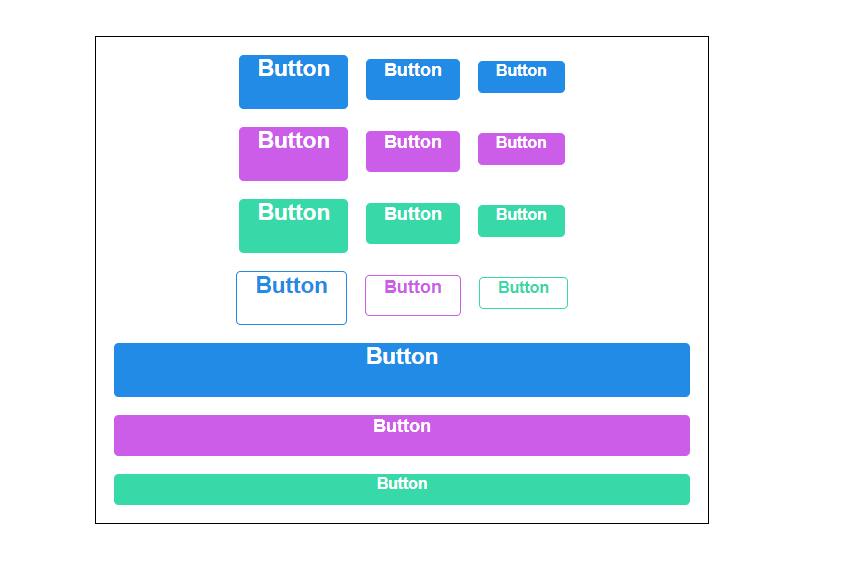
...rest props 전달
특정한 이벤트를 설정해주고 싶을때!
예를들어 onClick
import React from "react";
import './Button.scss';
import classNames from 'classnames';

function Button({children, size, color, outline, fullWidth, onClick}) {
    return (
        <button className={classNames('Button', size, color, {outline, fullWidth})}
                onClick={onClick}
        >
            {children}
        </button>
    );
}

Button.defaultProps = {
    size: 'medium',
    color: 'blue'
};

export default Button;
여기서 하나의 이벤트 더 추가?
onMouseMove
import React from "react";
import './Button.scss';
import classNames from 'classnames';

function Button({children, size, color, outline, fullWidth, onClick, onMouseMove}) {
    return (
        <button className={classNames('Button', size, color, {outline, fullWidth})}
                onClick={onClick}
                onMouseMove={onMouseMove}
        >
            {children}
        </button>
    );
}

Button.defaultProps = {
    size: 'medium',
    color: 'blue'
};

export default Button;
... 하나씩 추가하기는 너무 번거롭다!
그럴때 ...spread 를 쓰자.
import React from "react";
import './Button.scss';
import classNames from 'classnames';

function Button({children, size, color, outline, fullWidth, ...rest}) {
    return (
        <button className={classNames('Button', size, color, {outline, fullWidth})}
                {...rest}
        >
            {children}
        </button>
    );
}

Button.defaultProps = {
    size: 'medium',
    color: 'blue'
};

export default Button;
이렇게하면 끝이다.
...rest 가 우리가 지정한 props 를 제외한 값들을 rest 객체에 모아주고
해당 태크에 {...rest} 를 해주면 객체 안에 있는 값들을 모두 태그에 설정해줌
첫번째 버튼에 onClick () => log 를 설정하면 ?
import './App.scss';
import Button from "./components/Button";

function App() {
  return (
      <div className="App">
        <div className="buttons">
          <Button size="large" onClick={() => console.log("클릭하셨소?")}>Button</Button>
          <Button>Button</Button>
          <Button size="small">Button</Button>
        </div>
        <div className="buttons">
          <Button size="large" color="grape">Button</Button>
          <Button color="grape">Button</Button>
          <Button size="small" color="grape">Button</Button>
        </div>
        <div className="buttons">
          <Button size="large" color="teal">Button</Button>
          <Button color="teal">Button</Button>
          <Button size="small" color="teal">Button</Button>
        </div>
        <div className="buttons">
          <Button size="large" color="blue" outline>Button</Button>
          <Button color="teal" color="grape" outline>Button</Button>
          <Button size="small" color="teal" outline>Button</Button>
        </div>
        <div className="buttons">
          <Button size="large" color="blue" fullWidth>Button</Button>
          <Button color="teal" color="grape" fullWidth>Button</Button>
          <Button size="small" color="teal" fullWidth>Button</Button>
        </div>
      </div>
  );
}

export default App;

오늘도 화이팅
출처-
'JS Library > React' 카테고리의 다른 글
| styled-components (0) | 2022.08.02 |
|---|---|
| react-icons link (0) | 2022.08.01 |
| CSS Module (0) | 2022.08.01 |
| useReducer 요청 상태 관리 (0) | 2022.06.09 |
| API 연동하기, axios (0) | 2022.06.09 |
| Immer 라이브러리 (0) | 2022.05.26 |